Cacti Custom Graphing Features
The default graphs that ship with Cacti provide a good starting point for your monitoring needs. However, you may find that the graphs don’t draw attention to what you would like.
In this post, I’ll cover steps to customize your graphing functions. Also, we’ll cover ways to get more text information on your graphs, so lets begin.
The default network traffic graph is reminiscent of the days of MRTG. I like to set my graph with both inbound and outbound traffic represented as a solid line and a transparent area. Here is an example of how I set it up.
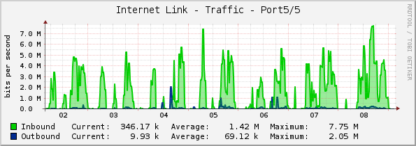
The legend has the solid colors to represent the values. The transparency prevents readings from being masked by top layer values. To get these settings on your graphs, you’ll need to edit them. Go to Console / Management / Graph Management. Select the graph you want to edit, in my example, that is Localhost – Traffic – wlan0. Click the link in the upper right hand corner, “Edit Graph Template”.
This is were the magic happens. In the top section “Graph Template Items”, click on the item that denotes the inbound traffic, mine says “(traffic_in): Inbound”.
The values I have set for my Inbound Line graph are as follows:
Data Source: Interface – Traffic – (traffic_in)
Color: 00CF00
Opacity/Alpha Channel: 100%
Graph Item Type: LINE1
Consolidation Function: AVERAGE
CDEF Function: None
Value:
GPRINT Type: Normal
Text Format: Inbound
Insert Hard Return:
Sequence: 2
For my Inbound Area graph, these are the settings:
Data Source: Interface – Traffic – (traffic_in)
Color: 00CF00
Opacity/Alpha Channel: 40%
Graph Item Type: AREA
Consolidation Function: AVERAGE
CDEF Function: None
Value:
GPRINT Type: Normal
Text Format:
Insert Hard Return:
Sequence: 10
I put emphasis on the items that were different to draw your attention to what’s going on here.
The Opacity value dictates how dark or light the graph item color should be in respect to its transparency. You can see that the area graph is 40% transparent, were as the line graph has no transparency. Also, you can see that the Graph Item Type tells what kind of graph to draw, ie LINE1 with a line width of 1 pixel, AREA for a solid graphing area.
The Text Format field is what appears in the graph legend along with a color box. I like to keep the non transparent colors out of the legend. The faded look can cause some visual confusion for me. However, format as you like.
The Sequence value is something I’ll explain in a bit. It will be easier to understand once I bring it all together.
The Outbound graph items are similar with the only key differnces being these:
Data Source: Interface – Traffic – (traffic_out)
Color: 0D006A
Text Format: Outbound
I follow the same Opacity and Graph Type conventions as I did with the Inbound traffic. Also, the legend value reflects what type of graph item this is.
Now, back to the Sequence values. The graph items are basically images that Cacti will create with the built in RRDTool function. Each item represents a layer image that will be stacked over the following graph items, much like cut out pieces of construction paper are stacked on each other.
I like to keep my area graph items on the bottom of the stack and my line graph items on the top. Reversing this order can wash out the line readings visually, should the area values exceed a line value.
Now the legend values that appear that show numeric values is a graph item that uses GPRINT. I haven’t covered this yet, so lets cover it now.
One of my graph items that deals with these type of readings is set as follows:
Data Source: Interface – Traffic – (traffic_in)
Color: None
Opacity/Alpha Channel: 100%
Graph Item Type: GPRINT
Consolidation Function: LAST
CDEF Function: None
Value:
GPRINT Type: Normal
Text Format: Current:
Insert Hard Return:
Sequence: 3
Again, drawing attention to the key values. GPRINT tells Cacti I want to write text to the graph legend at the bottom. The Text Format value is how I’m labeling the value in the graph.
The actual reading value is from the Consolidation Function setting. This can be set to LAST, MIN, MAX, or AVERAGE.
That pretty much covers how to customize the graphing in Cacti to suit your needs. Now I’ll cover how to plot values that are unknown.

There are occasions when gaps in your graph could mislead you to believe the readings are low. Placing unknown plot values can help you avoid this confusion. From the graph in this example, we can tell the system is off-line and not just idle.
To do this we need to create a special CDEF called “Unknown”. First, lets get into the Cacti Console / Management / Graph Management / CDEFs page. Click “Add” from the upper right hand corner of the page.
Enter in the new CDEF’s name, we’ll call it “Unknown”. Now we can add our CDEF Items, of which we will add 5 in total. Here is what you should enter in for each item and their order.
Item 1
CDEF Item Type: Special Data Source
CDEF Item Value: Current Graph Item Data Source
Item 2
CDEF Item Type: Custom String
CDEF Item Value: UN
Item 3
CDEF Item Type: Function
CDEF Item Value: INF
Item 4
CDEF Item Type: Function
CDEF Item Value: UNKN
Item 5
CDEF Item Type: Function
CDEF Item Value: IF
The CDEF should read “cdef=CURRENT_DATA_SOURCE,UN,INF,UNKN,IF”
I won’t explain what each means, it will result in a long and lengthy read. You can find out more on the Cacti website, http://www.cacti.net
Now we can edit our Graph Template and add our new CDEF to plot any unknown data readings. Do this by going to Console / Management / Graph Management – Select the graph you want to add the CDEF to. Next, select Edit Graph Template from the upper right hand corner.
In the Graph Template Items, note the Data Source then click the “Add” link. My example used a Data Source of “(load_1min)”
Set the values of the Graph Template Item as such:
Data Source: Unix – Load Average – (load_1min)
Color: FFC350
Opacity/Alpha Channel: 100%
Graph Item Type: AREA
Consolidation Function: AVERAGE
CDEF Function: Unknown
Value:
GPRINT Type: Normal
Text Format:
Insert Hard Return:
Sequence: 1
Just like before, I have drawn your attention to the key values in this graph template item.
I typically set this item as the first of the sequence, this is because I want these reading to be on top and not masked by other values.
Next, I set my color to pink and graph it as a non transparent area. This makes it easier to view since I rarely use pink for any other graph function.
Click Save and now your graph should plot values that are non numeric as unknown.
Conclusion, there is a bunch more you can do with Cacti. This is just a sample of some of the customization you can do.
I would like to thank Paul Porter for his write up, check it out.