Python Data Visualization
In an earlier post, python was used to generate an image from datasets. That method lacked the full features needed to create a final image. This post will introduce Plotly as a preferred method. It offers more options and is targeted for use as a tool for dataset visualization.
First we’ll need a dataset that is tangible. In this post the dataset will be generated from a field scan to create an image array. The device used to scan the field will be a photoresistor that will be pivoted by a pair of servos, each one on a x and y axis. This will be purely a theoretical scenario, so no actual code or hardware was developed for this concept.
The photoresistor used will be a standard cadmium sulfide LDR. The sensor was fitted with a focal guide to allow only a narrow angular field of view. This was done by fitting heat shrink tubing around the sensor and allowing a long narrow opening for light to enter. The datasheet can be found online here, https://www.tme.eu/Document/0b7aec6d26675b47f9e54d893cd4521b/PGM5506.pdf
As mentioned, the photoresistor sensor will take stepped measurements of a field horizontally and continue that pattern for each step vertically . The step of each motion has been set to 1 degree and is centered on the photoresistor’s sensor surface. Likewise, the pivot on the y axis is also centered on the photoresistor’s sensor surface with each motion step set to 1 degree. The range of motion will be limited to 60 degrees on the x axis and 35 degrees on the y. This should result in an array that has a 60 x 35 pixel resolution.
The speed that the servos can step will be limited by the response time of the photoresistor as defined in its datasheet. The larger value from either the rise or decay time for the sensor will determine dwell time for each measurement step or sample. Based on the datasheet, a dwell time of 50ms should be enough for the sensor to acquire its reading. Based on that limit, the entire time to scan the field will be x * y * 50 = time in ms, which is 1 minute and 45 seconds. So the object and photoresistor must be stationary for a reliable image to be created, which is why a still life was selected.
Any microcontroller that can be programmed to step the pair of servos, quantify a value measured by the sensor, format the readings with delimitation and carriage returns, and store the reading to memory is suitable for use. The final results should look similar to this.
135,135,135,....159,159,159
136,136,136,....159,159,159
...
138,137,137,....160,160,161
The dataset source file is here, SCN_IMG_GRAY_Array1
Once the scan is completed, the dataset can be processed by Plotly to create the image. Here is the python code used with this command “python3 SCN_IMG_GRAY_Array1_Plotly.py”
import plotly.express as px
from numpy import genfromtxt

data = genfromtxt('SCN_IMG_GRAY_Array1_Plotly.csv', delimiter=',')

fig = px.imshow(data, color_continuous_scale=px.colors.sequential.gray)

fig.update_layout(width=60, height=35, margin=dict(l=0, r=0, b=0, t=0), coloraxis_showscale=False)
fig.update_xaxes(showticklabels=False).update_yaxes(showticklabels=False)
# fig.show()

fig.write_image("SCN_IMG_GRAY_Array1_Plotly.png")

# Command - python3 SCN_IMG_GRAY_Array1_Plotly.py
# Source - https://plotly.com/python/heatmaps/
# Color Scales - https://plotly.com/python/builtin-colorscales/

# https://plotly.com/python/imshow/
# https://pypi.org/project/plotly-express/
# https://www.cloudacm.com/?p=2674
# https://plotly.com/python/plotly-express/
Here is the resulting image file generated, which has been zoomed 10 times in order to allow for easier viewing.
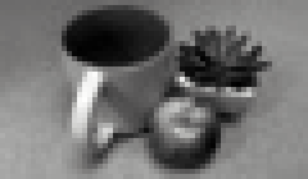
It is remarkable that a simple photoresistor can create a grayscale image, but with the use of color filters, datasets can be merged to create a full color image. This has been demontrated here with some background on the process.
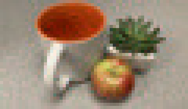
Each field scan is done using a separte color filter to only allow a given spectrum of color to reach the photoresistor. The resulting datasets are converted into grayscale images using the python process already discussed. This will result in 3 layers that are red, green, blue. Using Imagemagick, the 3 layers can be combined to create the color image. This is done using the following command.
convert SCN_IMG_RED_Array1_Plotly.png SCN_IMG_GREEN_Array1_Plotly.png SCN_IMG_BLUE_Array1_Plotly.png -combine -set colorspace sRGB SCN_IMG_COLOR_Array1_Plotly.png
The following resized image is the result and it appears something is going on.

If we look at the datasheet, the light spectrum response of the photoresistor is not level across all of the color ranges. The following image is an overlay to give a better visual of what colors are affected.
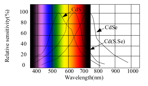
Based on that color curve, the blue value is 60 percent and the red value is 35 percent of what green is. If we apply that logic to our datasets, we can adjust the values for blue and red to be level with the green values. After doing that adjustment and merging the images, we now have a more realistic color image.
This is fundamentally what all color cameras are, except on a much smaller scale. Instead of a single sensor that changes color filters and scans each scene, an array of millions of sensors that have color filters built in are used. Here is a view of a modern camera sensor.
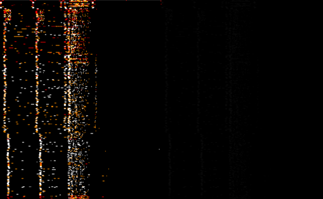
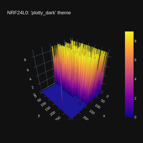
The acquiring and processing of the dataset to reproduce a scene into an image might have detracted or convoluted the intent of this post. For that reason, another example of python visualization will take a dataset created by a NRF240L0 sensor. The earlier post used a dataset to create a waterfall image of the RF scan. This same dataset was used to create the following image that is side by side with the original using this imagemagick command, “convert +append NRFDATA2A.png NRFDATA2B.png -resize 315x NRFDATA2C.png” The Plotly image is on the left, the unprocessed python method is on the right.
Plotly offers many more options on how to visualize the dataset, not just based on color scale, but also style. Here is another example of the same dataset.
This is fundamentally the process to generate wifi heat maps as demonstrated here.
https://github.com/jantman/python-wifi-survey-heatmap
https://pypi.org/project/whm/
Data visualization can take cold analytics and make them tangible. The next post will introduce Processing as another visualization tool for taking sensor data and making it alive.